Hi everyone 
One of Vaperina’s most important elements, the editor, has been renewed.
The update has two main goals: modernizing the editor’s overall appearance and drastically improving the mobile writing experience.
 The most important new features and changes:
1. New layout and structure
-
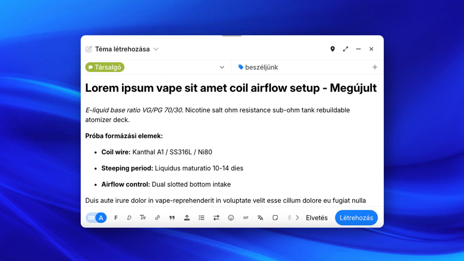
Notion-like titling: The topic title is integrated into the content, much more like a document’s main title (and has received a larger font size than a standard
H1(Header 1). -
Toolbar in the footer: The row of formatting buttons has been moved to the bottom of the editor (this will require some getting used to in the first few days).
-
Rethought category and tag selector: More transparent, fewer distracting borders, and the sense of space has become much airier.
-
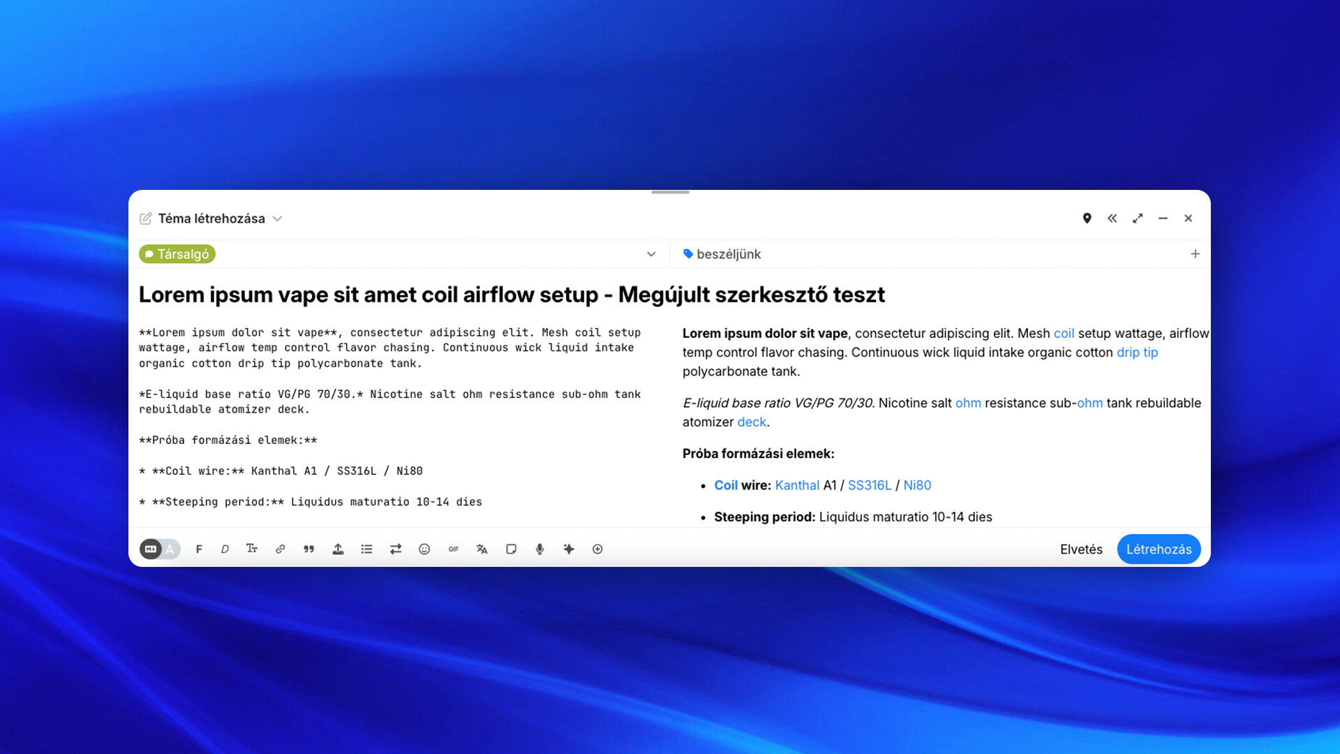
Wider metadata area: In Markdown editing mode, the title, category, and tags are now located in the full-width top bar above the writing and preview windows.
Markdown editor with preview
Visual editor
2. Significantly increased mobile writing surface
Based on feedback from mobile users, the biggest problem was the cramped writing window.
-
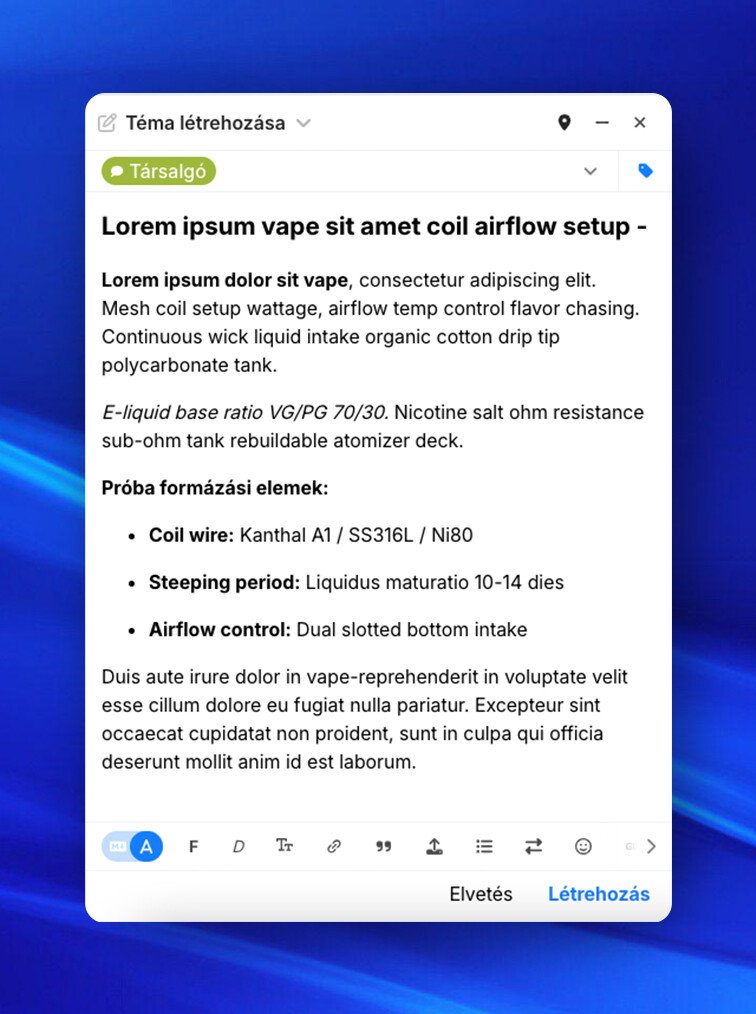
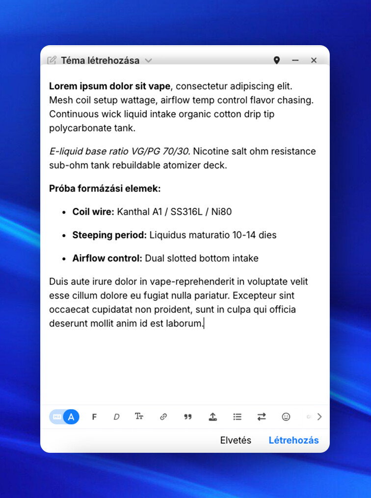
Expanding editor: When writing a new topic or private message, as soon as you click into the text field, the editor slides up and covers the fields above it. This more than doubles the usable writing surface (from approx. 103px to 212px, depending on the device).
-
Swipe down: A simple swipe down gesture can hide the keyboard and collapse the field.
-
Compact tags: On mobile, selected tags are hidden in the menu by default (a colored icon indicates if a tag is selected), leaving more space for the category.
Mobile visual editor
Mobile visual editor, slid up after tapping text field
 This is currently still in beta phase, so details may change.
What do you think of the new interface at first glance? Do you find it more convenient to use?
 New Feature: Expand Topics